
Imagine this in your mind’s eye: a small, innocuous road sign sitting staked in the grass. It’s completely white, with small, bland text that reads: “Warning: Turn Around”. Beyond it, in the middle of a busy road, lies a hidden sinkhole.
How many people do you think will stop? Realistically, this seems like a recipe for a few too many sinkhole-related incidents.
Now, imagine that the same sign is rendered in an alarming red. The now white letters are larger and capitalised, dominating the entire width of the sign. There might even be flashing lights accompanying the display.
Motorists would almost certainly heed this new and improved sign. It would be hard not to! So, what is the core difference between these two signs and their respective scenarios?
Both signs say the exact same thing, in the exact same place, under the exact same circumstances. With identical contexts, the real difference lies in how the audience – in this case, the motorists – interacts with the content, and react to it.
In a world that is full of attention-grabbing marketing campaigns, and the flashing lights of an interconnected digital landscape, visual content has become a language of its own.
For those creating said content, it’s essential to understand this language and use it to your advantage. Otherwise, your message might be misinterpreted.
Visual content – as per the name – is anything that you can see. Text on a pamphlet, the layout of a website’s homepage, or a corporation’s ‘About Us’ video. All of these are examples visual content.
One of the best examples of excellent visual content is the infographic, which we touched upon in a previous post. Infographics are designed to convey information via images and visual stimuli; they pack a lot of information into limited pixels, and convey the most important pieces of it to viewers through visual tricks to draw them in.
A great power of infographics is their ability to convey information to laymen. Even a person new to the topic in question will be able to walk away with the key facts. Why? Because they were connected to something visual that will have enhanced their ability to interpret the information.
The visual aspect of content is almost a language itself, influencing how the message of the content is interpreted by the viewer. It’s a perceivable subtext, letting viewers in on the underlying intent in a way that they might not even be registering. After all, what separates good and great visual content is coded into us by our social conditioning, and our existing knowledge of the other content out there – we all know what great content looks like. It becomes almost innate.
The question is, how do modern-day marketers use this secondary digital language to their benefit? The key is to ensure that when you’re creating visual content, you ask yourself these two questions.
The visual medium triggers many feelings whenever we see the right combination of shapes and colours. When building your content, consider which emotions you want to inspire in your audience. Should they feel calm or excited? Do you want them to feel dread or overwhelming joy? The fonts, colours, and even visual spacing you choose, will contribute to the result.
There’s intent, and then there’s interpretation. Miscommunication happens when there is a significant gap between the two. How you word your content is crucial, but the way that you place it on the page is just as important. Put key messages front and centre, drawing your viewer’s attention, while less important sidenotes can be pushed further to the background, and into the corners.
To get an idea of how powerful the visual representation of content can really be, let’s review two examples of how visuals can impact meaning.

Spotify’s Wrapped feature was conceived by an intern who saw a gap in the firm’s approach to user interaction, and found a way to fill it. The end-of-year Wrapped is hotly anticipated by Spotify’s user base, providing a way for friends to connect over their music tastes.
The beautiful thing about these infographics is how well they represent both tangible and intangible information – your most played songs, versus how your music listening habits represents your personality. They are intended to be shared between friends and on social media, allowing quick and easy comparison of music tastes to drive discussion and more plays on Spotify. So, the visuals had to be clean and clear, but packed with excitement and interest. Hence, this bundle of highly interactive colour-popping infographics with clean, easy-to-read lines and minimal text.
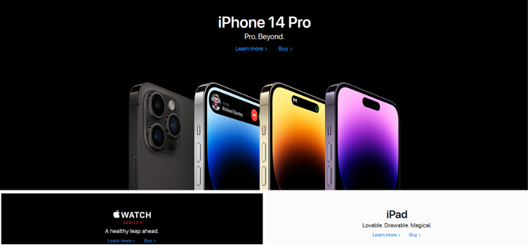
Apple’s website is a clear reminder that less can definitely be more. We can get caught up in trying to pack more into a visual layout to convey enhanced meaning or excitement. However, what the Apple site’s design clearly shows is that minimalism is just as effective.
Rather than attempting to condense as much as possible onto the page, what’s important here is clarity. Every product is given its own space, with the latest release occupying the top spot on the page, placed to drive clicks. There are no long-winded descriptions – the site allows images to speak for the products with a few key emotive descriptors that can enhance connection. While this might feel overly simple, Apple’s site exudes quality thanks to its carefully considered font, layout, and image quality.
With these examples and many more populating the realm of online marketing, it’s easy to see why visualising your content is more important than ever before.